
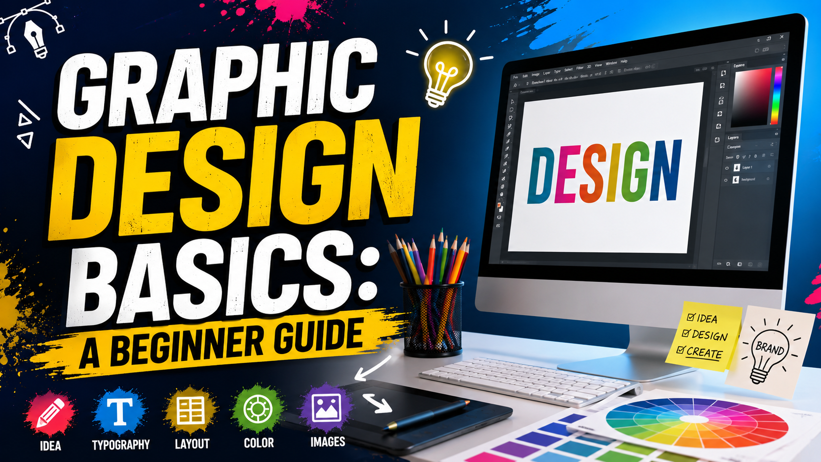
Have you ever seen a cool YouTube thumbnail, gaming logo, poster, website, or Instagram post and thought, “How did they make that?”
I have thought about this many times too.
At first, graphic design can look very difficult. You see people making amazing posters, logos, banners, thumbnails, and social media posts, and it feels like they have some special talent.
But the truth is, graphic design can be learned.
You don’t need to be an expert artist. You don’t need a super expensive computer. You also don’t need to know every tool in Photoshop on your first day.
You just need to understand some basic ideas and practice them again and again.
That is why I made this simple guide about graphic design basics for beginners.
“Good design is not about adding everything. It is about knowing what to add and what to remove.”
So, let’s start from the beginning.
What Is Graphic Design?
Graphic design is basically a way of using text, colors, images, shapes, and space to communicate an idea.
For example, when you see a poster for a movie, you can understand what the movie is about because of its pictures, colors, title, and layout.
A YouTube thumbnail also uses graphic design. A gaming logo uses graphic design. A school presentation can use graphic design too.
Graphic design is almost everywhere.
You can find it in:
- YouTube thumbnails
- Gaming logos
- Websites
- Mobile apps
- Posters
- Advertisements
- Social media posts
- Product packaging
- Business cards
- Book covers
- School projects
- Banners
The main goal is not just to make something look pretty.
The main goal is to communicate something clearly.
This is one of the most important parts of graphic design basics.
Read More: 7 Powerful Steps to Build an AI Study Assistant Project That Can Change How You Learn
Why Should Beginners Learn Graphic Design?
I think graphic design is a really useful skill because you can use it for many things.
For example, if you have a YouTube channel, you can make your own thumbnails and banners.
If you have a website, you can create better images for your posts.
If you like gaming, you can create gaming logos, posters, thumbnails, and wallpapers.
Even if you don’t want to become a professional designer, learning design can help you become more creative.
The best part is that you can start small.
You don’t have to make a huge advertisement on your first day.
Start with a simple poster.
Then make a thumbnail.
Then try a logo.
After some practice, you will slowly understand what looks good and what doesn’t.
The Important Parts of Graphic Design Basics
There are many things to learn in graphic design, but beginners should first focus on a few important areas.
These include:
- Typography
- Color
- Layout
- Images
- Shapes
- Space
- Contrast
- Alignment
- Balance
- Visual hierarchy
Design guides commonly describe these ideas as important foundations because they help organize a design and guide the viewer’s attention.
Let’s understand them in simple words.
1. Typography
Typography simply means how text looks and is arranged.
It includes fonts, font size, spacing, thickness, and position.
For example, imagine a poster with this text:
BIG GAMING EVENT
If the title is tiny and difficult to read, people may ignore it.
But if the title is large, clear, and easy to read, people will notice it quickly.
That is why typography is very important.
There are different types of fonts.
Serif Fonts
These fonts have small decorative lines on letters.
They can look traditional or formal.
Sans-Serif Fonts
These fonts are cleaner and simpler.
They are very common on websites, apps, posters, and modern designs.
Script Fonts
These look more like handwriting.
They can look cool, but don’t use them everywhere because they can become difficult to read.
My Beginner Tip
Don’t use 10 different fonts in one design.
Try using one font for the main heading and another font for smaller text.
Two fonts are often enough for a simple design. Some beginner guides also recommend keeping font choices limited to around two or three fonts.
2. Learn Color
Color is one of my favorite parts of graphic design.
Colors can change the whole feeling of a design.
For example:
- Red can feel powerful or energetic.
- Blue can feel calm and professional.
- Green can feel natural or fresh.
- Yellow can feel bright and happy.
- Black can feel strong or modern.
- White can make a design feel clean.
But don’t just choose colors randomly.
Try to think about what feeling you want your design to have.
If you are making a scary gaming thumbnail, bright pink, green, and yellow may not always be the best choice.
If you are making a fun children’s poster, bright colors might work really well.
Color theory is a big topic, but beginners can start by learning about primary colors, secondary colors, complementary colors, and color palettes.
“Colors should support your message, not fight with it.”
A simple trick is to choose two or three main colors and use them consistently.
3. Understand Layout
Layout means where you put everything.
Think about a school notebook.
If the title is at the top, the paragraphs are below it, and everything is nicely spaced, it is easy to read.
A graphic design works in a similar way.
You need to decide:
- Where should the title go?
- Where should the image go?
- Where should the button go?
- How much empty space should I leave?
- What should people see first?
A good layout makes the design easier to understand.
You can use grids and guides to help keep things organized.
Don’t place everything randomly.
4. Visual Hierarchy
This sounds like a difficult word, but it is actually simple.
Visual hierarchy means showing people what they should look at first, second, and third.
For example, imagine a poster saying:
SUMMER SALE
50% OFF
Shop Now
The biggest text might be “SUMMER SALE.”
Then “50% OFF” can be the second most important thing.
“Shop Now” can be smaller.
This creates an order for the viewer’s eyes.
You can create hierarchy using:
- Bigger text
- Smaller text
- Bold fonts
- Different colors
- Images
- Position
- Contrast
Good hierarchy helps viewers understand a design quickly.
5. Contrast
Contrast means making things different enough so they stand out.
For example, black text on a white background has strong contrast.
A large heading next to small text also creates contrast.
You can create contrast using:
- Light and dark colors
- Big and small text
- Thick and thin fonts
- Large and small shapes
- Different colors
- Different image sizes
Contrast can make a boring design much more interesting.
But don’t go crazy.
If everything is extremely colorful and huge, then nothing looks important anymore.
6. Alignment
Alignment means keeping things lined up properly.
Imagine you have three text boxes.
If one is slightly to the left, another is in the middle, and another is far to the right for no reason, the design can look messy.
But if they line up nicely, the design instantly looks more organized.
Alignment is a small thing, but it makes a big difference.
“If something looks slightly wrong, check the alignment first.”
Many design programs have guides that help you line up objects correctly.
7. Don’t Be Afraid of Empty Space
This is something many beginners don’t understand.
When I first started looking at designs, I thought empty space was wasted space.
But it is not.
Empty space is also called white space or negative space.
It gives your design room to breathe.
For example, imagine a poster with text, pictures, icons, stickers, shapes, and colors everywhere.
It can become hard to understand.
Now remove some of those things.
Suddenly, the important text may become easier to see.
That’s the power of empty space.
You don’t have to fill every corner.
Adobe’s design guide also explains that white space can help separate elements, improve organization, and make important parts stand out.
8. Images and Graphics
Images are another important part of graphic design basics.
A good image can make a design much better.
But the image should match the message.
For example, if you are making a football poster, use a football-related image.
If you are making a technology poster, use technology-related visuals.
Also remember that not every image needs to be huge.
Sometimes a small image with good placement looks better than a giant image covering everything.
Try to keep your images sharp and clear.
A blurry image can make even a good design look unprofessional.
Important Graphic Design Information
| Topic | Beginner Tip | Why It Matters |
|---|---|---|
| Typography | Use 1–2 main fonts | Makes text easier to read |
| Color | Start with 2–3 main colors | Keeps the design consistent |
| Layout | Use grids and guides | Keeps everything organized |
| Contrast | Make important things stand out | Helps viewers notice key information |
| Alignment | Line up related elements | Makes the design cleaner |
| White Space | Don’t fill every empty area | Gives the design room to breathe |
| Images | Use clear and suitable images | Improves visual quality |
| Hierarchy | Make important information bigger | Guides the viewer’s eyes |
| Balance | Spread visual weight properly | Makes the design feel stable |
| Practice | Make small projects regularly | Improves your skills |
Beginner Tools for Graphic Design
You don’t need expensive software to begin.
There are many tools available.
Some are very simple, while others are made for professional designers.
For beginners, tools such as Canva can be easier to understand because they use simple editing features.
Figma is useful for interface and digital design.
Photoshop is popular for image editing and many types of graphic work.
Illustrator is commonly used for vector graphics and logo work.
The important thing is not which software you use.
The important thing is understanding design.
A person can use expensive software and still make a bad design.
Another person can use a simple tool and make something amazing.
So don’t spend all your time looking for the “perfect” software.
Start designing.
Easy Graphic Design Projects for Beginners
If you are learning graphic design basics, practice is extremely important.
Here are some projects you can try.
Project 1: YouTube Thumbnail
Make a thumbnail for a fake gaming video.
Try using:
- One main image
- One big title
- Two or three colors
- A simple background
Project 2: Gaming Logo
Create a logo for a fake gaming team.
Try making the name short and easy to read.
Project 3: Movie Poster
Choose an imaginary movie and make a poster.
Think about the mood before choosing colors.
Project 4: Social Media Post
Make a square social media post with a simple quote.
Try different fonts and layouts.
Project 5: Event Poster
Create a poster for a school gaming competition or sports event.
Include the event name, date, time, and location.
These small projects will teach you much more than just watching tutorials.
Common Mistakes Beginners Make
Everyone makes mistakes when learning.
I definitely think mistakes are part of the process.
Here are some common ones to avoid.
Using Too Many Fonts
If every word uses a different font, the design can look confusing.
Keep it simple.
Using Too Many Colors
A rainbow can look cool, but not every design needs every color.
Choose a small color palette.
Filling Everything
Don’t put something in every empty space.
Let the design breathe.
Making Everything Huge
If everything is big, nothing has priority.
Use size to show importance.
Ignoring Readability
A design can look cool but still be bad if nobody can read it.
Always check your text.
Copying Other Designers
Looking at other designs is a great way to learn.
But don’t simply copy someone else’s work and call it your own.
Study what they did.
Ask yourself:
Why does this design look good?
Then try to use the idea in your own way.
How to Improve Your Design Skills
The easiest way to improve is to practice regularly.
You don’t have to design for five hours every day.
Even 20 or 30 minutes can help if you do it regularly.
You can also look at professional designs and study them.
When you see a cool poster, don’t just say, “That looks nice.”
Ask yourself:
- Why did they choose these colors?
- Why is the heading so big?
- Why is the image placed there?
- Why is there empty space?
- Which part do I see first?
- How many fonts did they use?
This turns normal browsing into learning.
You can also save designs you like and create your own version for practice.
After making something, look at it again the next day.
Sometimes you will immediately notice something you want to change.
That’s normal.
Your first design doesn’t have to be perfect.
Your tenth design will probably be better.
Your hundredth design can be much better.
A Simple Beginner Design Formula
If you don’t know where to start, try this simple formula:
1 main image + 1 strong heading + 2–3 colors + 1–2 fonts + enough empty space
That’s it.
Don’t try to add 50 things.
Start simple.
Once you understand the basics, you can slowly add more advanced effects.
You can learn shadows, gradients, masks, effects, photo editing, 3D design, motion graphics, and many other things later.
But first, learn the foundation.
Useful Links and Learning Information
| Resource | What You Can Learn |
|---|---|
| Adobe Graphic Design Basics | Basic design principles and visual hierarchy |
| Wacom Graphic Design Guide | Alignment, contrast, balance, color, space, and other principles |
| 4 The Creatives Fundamentals Course | Beginner lessons about typography, color, layout, and composition |
My Simple Advice for New Designers
If you are just starting, don’t worry too much about making professional designs immediately.
You are learning.
Your first designs may look weird.
Your colors may not match.
Your fonts may look bad together.
Your layout may be messy.
That’s completely okay.
Every designer starts somewhere.
Instead of saying, “I’m bad at design,” say:
“I’m still learning design.”
That small change in thinking can make learning much more fun.
Also, don’t compare your first design with someone’s 10 years of experience.
Compare your new design with your old design.
If today’s design is better than yesterday’s design, you are improving.
Frequently Asked Questions
1. What are graphic design basics?
Graphic design basics are the main ideas beginners need to understand when creating designs. These include typography, color, layout, alignment, contrast, balance, hierarchy, images, and white space.
2. Can I learn graphic design as a complete beginner?
Yes. You can start from zero. You don’t need to be an amazing artist. Start with simple projects and learn one topic at a time.
3. Which software should a beginner use?
You can start with a simple design tool such as Canva. Later, you can learn tools such as Figma, Photoshop, or Illustrator depending on what type of design you want to make.
4. How many fonts should I use in one design?
For beginners, one or two main fonts are usually enough. Using too many fonts can make a design look messy.
5. How can I become better at graphic design?
The best way is to practice. Make thumbnails, posters, logos, banners, and social media posts. Study designs you like and try to understand why they work.
Conclusion
Learning graphic design basics is not as scary as it first looks.
You don’t need to learn everything in one day.
Start with the simple things.
Learn how colors work.
Learn how fonts work.
Learn how to create a clean layout.
Understand contrast and alignment.
Use empty space.
Learn how to guide the viewer’s eyes.
Most importantly, practice.
You can watch hundreds of tutorials, but your skills will really improve when you start making things yourself.
Make a thumbnail.
Make a poster.
Make a logo.
Make something bad.
Then make it better.
That’s how you learn.
“Don’t wait until you are a great designer to start designing. Start designing, and you will become a better designer.”
Graphic design is a skill that can take time, but it can also be a lot of fun. So open your design software, choose a simple project, and start creating.
Your first design may not be perfect. And that’s okay. Your next one can be better.
Want a professional website designed for your business or blog?
Visit eDigitalized for website design and development services.
Need help or support?
Visit our Contact Us page and get in touch with us.
Want to become a blogger and start your own blog?
Visit WP Bazaar for blogging resources, tools, and helpful guides.
How this guide was prepared
This guide is prepared for everyday readers using practical research, usability checks and editorial review. Product or tool-specific claims should be verified against current official documentation when needed.
How did you like this article?
Your feedback helps us make our guides more useful.

Join the Discussion
Join the conversation and share a useful tip, question or experience.