
Quick Start
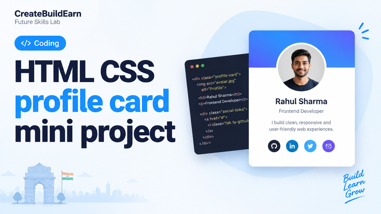
What you will learn/build: A simple, responsive profile card component using HTML and CSS that you can use on a personal site or portfolio.
Skill level: Beginner (basic HTML & CSS). Good if you have used tags, classes and simple CSS selectors.
Time needed: 30–90 minutes (faster if you copy/paste code and tweak).
What you need: A computer, modern browser (Chrome/Firefox/Edge), a text editor (VS Code, Notepad++ or similar), and optionally an image for the avatar. Free tools are fine.
Introduction — What is a profile card and why build one?
A profile card is a compact design element that shows a person’s photo, name, role and quick links. It’s a common building block for portfolios, team pages and landing sections. Building one is a great mini project: it teaches layout, spacing, typography and responsive thinking that you will reuse in larger websites.
Learning goals and prerequisites
- Understand basic HTML structure: elements, classes and semantic tags.
- Use CSS for layout: box model, flexbox, colors, typography and simple responsive rules.
- Create a reusable component you can add to a portfolio.
Prerequisites: a few simple HTML tags (div, img, h3, p, a) and basic CSS (selectors, properties). No JavaScript required for the core card.
Step-by-step build path
Follow these steps to create your profile card. Each step is small and testable in the browser.
- Create an HTML file and a CSS file, then link them.
- Write the HTML structure for the card: an outer container, an avatar, name, role and buttons/links.
- Style the card: width, padding, border-radius, box-shadow and colors.
- Use flexbox to align content vertically and horizontally.
- Add responsive behavior: make the card fluid and set a max-width for larger screens.
- Test on mobile and desktop; tweak spacing and font sizes.
Worked example — full HTML + CSS
Copy this example into two files: index.html and styles.css. Open index.html in a browser to see the result.
<!-- index.html -->
<!doctype html>
<html lang='en'>
<head>
  <meta charset='utf-8'>
  <meta name='viewport' content='width=device-width, initial-scale=1'>
  <title>Profile Card Example</title>
  <link rel='stylesheet' href='styles.css'>
</head>
<body>
  <main class='page'>
    <section class='profile-card'>
      <img class='avatar' src='avatar.jpg' alt='Avatar of Priya Patel'>
      <div class='card-body'>
        <h3 class='name'>Priya Patel</h3>
        <p class='role'>Frontend Developer & Designer</p>
        <div class='links'>
          <a href='#' class='btn'>Portfolio</a>
          <a href='#' class='btn btn-outline'>Contact</a>
        </div>
      </div>
    </section>
  </main>
</body>
</html>

<!-- styles.css -->
body{font-family:system-ui, -apple-system, 'Segoe UI', Roboto, 'Helvetica Neue', Arial; background:#f4f6f8; margin:0; padding:24px; display:flex; align-items:center; justify-content:center; min-height:100vh}
.profile-card{background:#fff; width:100%; max-width:320px; border-radius:12px; box-shadow:0 6px 18px rgba(0,0,0,0.08); overflow:hidden; text-align:center; padding:20px}
.avatar{width:96px; height:96px; border-radius:50%; object-fit:cover; margin:-60px auto 12px; border:4px solid #fff; box-shadow:0 4px 10px rgba(0,0,0,0.06)}
.card-body{padding-top:8px}
.name{margin:8px 0 4px; font-size:1.1rem}
.role{margin:0 0 12px; color:#556; font-size:0.95rem}
.links{display:flex; gap:8px; justify-content:center}
.btn{display:inline-block; padding:8px 14px; border-radius:8px; text-decoration:none; background:#0b72ff; color:#fff; font-weight:600}
.btn-outline{background:transparent; color:#0b72ff; border:1px solid rgba(11,114,255,0.15)}

/* Responsive tweak */
@media (max-width:360px){.profile-card{padding:16px}.avatar{width:80px;height:80px;margin-top:-40px}.name{font-size:1rem}}
Explain the key parts
- HTML: semantic structure with an image, headings and links. The
altattribute is important for accessibility. - CSS: box model, border-radius for rounded corners, and box-shadow for depth. Flexbox or simple inline-flex keeps buttons aligned.
- Responsive: max-width plus media query adjusts sizes on small screens.
Try It Now / Mini Project
Create your own variant of the profile card. Tasks:
- Replace the avatar with your photo (or a free avatar image). Keep file name consistent or update the
src. - Change colors and fonts to match your personal brand.
- Add one social icon link (use plain text or an emoji) and hide it visually on small screens using CSS.
- Save the card as a single component and add two cards side-by-side to practice layout.
Checkpoint — Self-review questions
- Does the card look good at mobile widths and desktop widths?
- Is the avatar image using
alttext and an appropriate size? - Can you change the color and font easily using CSS variables or a single rule?
- Does the layout remain readable if text becomes longer?
Common mistakes and how to fix them
- Using fixed widths like
width:320pxonly — prefermax-widthso the card can shrink on small screens. - Not setting
object-fit:coveron images — this can stretch avatars. Useobject-fitto keep the crop correct. - Forgetting
alton images — always add descriptive alternative text for accessibility. - Too many nested elements — keep structure simple for easier styling and maintenance.
Review checklist
| Item | Why it matters | Done? |
|---|---|---|
| Responsive width | Card works on phones and desktop | |
| Accessible image alt | Screen readers get context | |
| Clear visual hierarchy | Name and role are easy to read | |
| Reusable CSS class names | Easy to copy and reuse |
Next practice — ideas to grow this mini-project
- Add small JavaScript to flip the card and show contact details on the back (safe, simple interaction).
- Create a grid of cards for a team page and practice responsive columns.
- Make a print-friendly version for your resume PDF export.
Where this fits in your learning path
This mini project sits inside front-end basics. After you complete it, try related lessons on responsive design and portfolio building:
- Responsive Web Design Mobile-First Basics
- Beginner Portfolio Before Client Work
- Personal Brand Consistency and Proof of Work
Frequently Asked Questions
Do I need to know JavaScript to make a profile card?
No. A basic profile card only needs HTML and CSS. Use JavaScript later to add interactivity like toggles or animations.
What image size should I use for an avatar?
Use a square image at least 400x400px for clarity, but the browser will scale it. Keep file size small (compressed JPEG/WEBP) for faster loading.
How do I test mobile view?
Open your page in a browser, then use the Developer Tools device toolbar (Ctrl+Shift+M in many browsers) or resize the window. Also test on a real phone when possible.
Can I use icons (like social icons) without external libraries?
Yes. Use SVGs or emoji, or include icon fonts carefully. For beginners, simple text links or SVG inline icons are safest and fastest.
Where can I host this for free to show in my portfolio?
Free options exist (GitHub Pages, Netlify Starter). Verify current platform terms before publishing and don’t upload sensitive personal data.
Is it okay to use AI to generate images or copy for the card?
Yes if you follow responsible use: verify the output, avoid giving personal identification data to AI tools, check usage rights for generated images and clearly label AI-assisted content if required by platform rules.
Conclusion and next skill to learn
You built a functional, responsive HTML CSS profile card. This is a small but powerful element to include in a portfolio or website. Next, learn responsive grid layouts and simple JavaScript interactions to make cards interactive. A good next article is our Responsive Web Design Mobile-First Basics linked above.
Good practice: save this project in a folder, push it to a GitHub repository, and add the link to your portfolio as proof of work. Focus on clean structure and reusability rather than perfection.
Learn it by building something
Use the guide as a learning checklist, build a small version yourself, test it, explain what you learned and then improve the project.
How this guide was prepared
This guide is prepared for everyday readers using practical research, usability checks and editorial review. Product or tool-specific claims should be verified against current official documentation when needed.
How did you like this article?
Your feedback helps us make our guides more useful.


Join the Discussion
Join the conversation and share a useful tip, question or experience.