
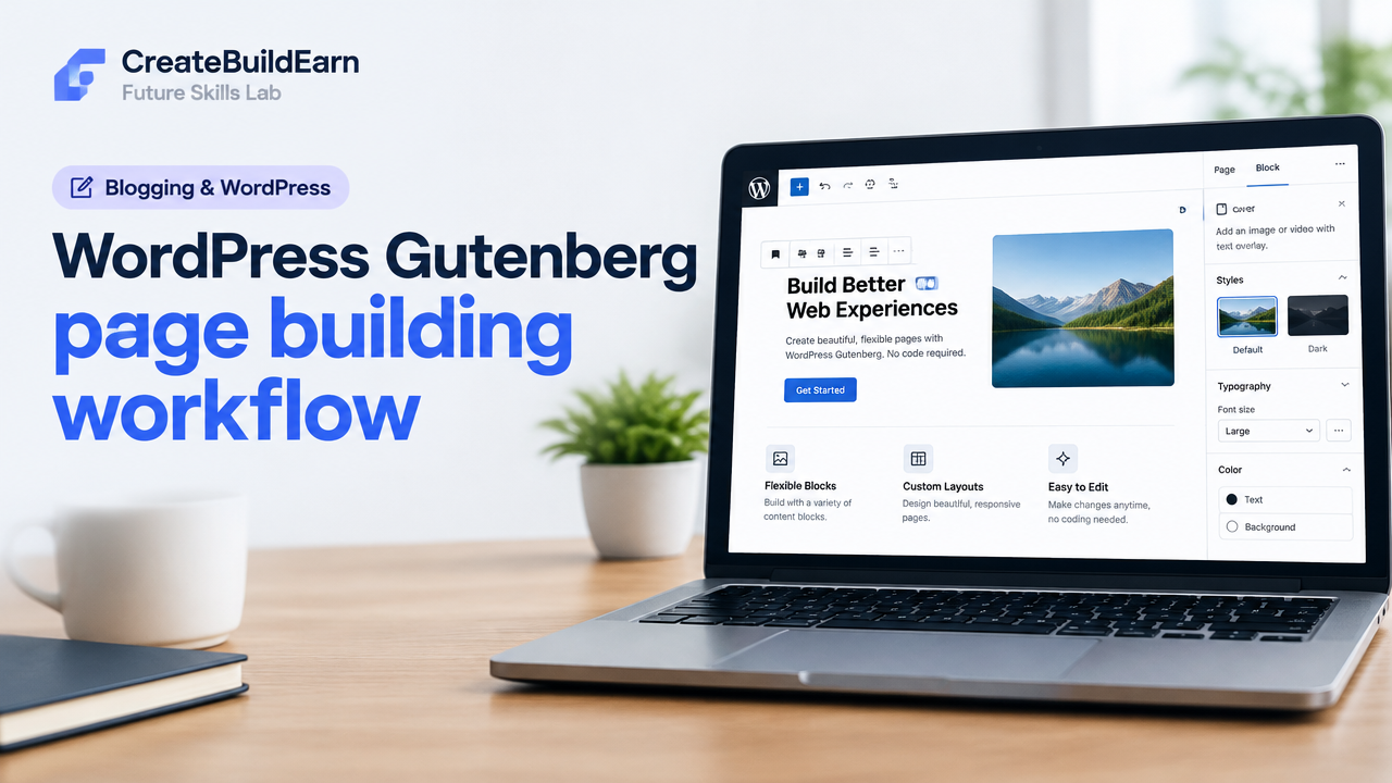
Quick Start
What you will learn/build: A clear Gutenberg workflow to plan and build a responsive WordPress page (hero, features, CTA, footer).
Skill level: Beginner (no code required; optional small CSS snippet).
Time needed: 45–90 minutes for the sample page; 15–30 minutes for one practice block or small edits.
What you need: A WordPress site (hosting + admin access), a theme that supports the block editor, images you can legally use, and a short page plan (headlines, short text, CTA).
Introduction: What this workflow gives you
Gutenberg is WordPress’s block editor: it replaces the old editor with building blocks for headings, images, columns, buttons and more. A reliable workflow helps you move quickly from idea to a live page, keep content consistent, and avoid common mistakes like poor mobile layout or missing image alt text.
What is Gutenberg and why use it?
Gutenberg uses blocks as modular content units. Each block has its own settings, style and structure. This makes pages easier to edit, reuse and keep consistent without custom coding. For beginners, blocks reduce friction: you can drag, duplicate and reposition pieces of content visually.
Prerequisites and safe setup
Before you start: ensure your WordPress version supports the block editor (WordPress 5.0+). Many modern themes support Gutenberg; if your theme is old, test the editor on a staging site or enable a default theme (e.g., Twenty Twenty-Three or a block-based theme).
- Admin access to WordPress dashboard
- One theme with block support
- Basic images (at least 3), headlines and short descriptions
Tip: If you add plugins, choose reputable ones from the WordPress.org repository and check reviews and last-updated dates. Always back up before major changes.
Overview: The Gutenberg page building workflow
Follow these steps as a checklist: Plan → Create → Structure → Style → Optimize → Test → Publish. Each step has small actions you can repeat for any page.
- Plan: gather brief, goals, target CTA, and assets.
- Create: open Page → Add title → Insert primary blocks.
- Structure: use Groups, Columns, and Spacers to control layout.
- Style: set fonts, colors and spacing via block settings or theme options.
- Optimize: add alt text, compress images, set meta, use headings.
- Test: preview on desktop/tablet/mobile, check links and performance.
- Publish: set visibility and schedule if needed.
Step-by-step: Build a simple Course Landing Page (worked example)
We’ll build a one-page layout: Hero, Features, Curriculum list, Testimonials, CTA, Footer.
- Dashboard → Pages → Add New. Enter page title: “Intro to Web Basics”.
- Hero section: Add a Cover block or Group with background image. Inside it, add a Heading block (H1), a Paragraph, and a Button block for the CTA.
- Features row: Add a Columns block (three columns). In each column add an Image block, Heading (H3), and Paragraph.
- Curriculum: Add a List block with main modules, or use a Group > Heading > List.
- Testimonials: Use Quote blocks or a Media & Text block for each testimonial.
- CTA section: Add a centered Button block with clear text like “Enroll Now” and set link to contact or checkout page.
- Footer: Add site footer area or simple Paragraph with contact details. Save draft.
Worked example content structure (copy into your page as you add blocks):
Cover: Hero Image + H1 "Intro to Web Basics" + Paragraph + Button
Columns (3): Feature 1, Feature 2, Feature 3
Heading H2: "Course Curriculum"
List: Module 1 • Module 2 • Module 3
Heading H2: "What students say"
Quote, Quote
CTA: Button "Enroll Now"
Optional small CSS learning example: add a custom class to your hero Group (advanced settings > Additional CSS class(es): hero-section) and include this CSS in Customizer > Additional CSS or child theme. This is a learning example only.
/* Learning example: center hero text and add soft overlay */
.hero-section .wp-block-cover__inner-container {text-align:center; padding:3rem 1rem;}
.hero-section .wp-block-button__link {border-radius:6px; padding:0.8rem 1.6rem;}
Practical checklist before publishing
| Item | Why it matters | Action |
|---|---|---|
| Headings | Structure for readers & SEO | Use H1 for title, H2 for sections, H3 for subsections |
| Alt text | Accessibility & image search | Add descriptive alt text to every image |
| Mobile layout | Most users visit on phones | Preview mobile and adjust column stacking |
| Links | Navigation & conversion | Test all internal and external links |
| Meta | Search appearance | Set page meta title and meta description (via SEO plugin) |
Try It Now / Mini Project
Mini-project: Build a 1-page personal portfolio with Gutenberg. Requirements:
- Hero with name and 1-sentence bio, one CTA button linking to contact.
- Three project cards using Columns; each card has image, title and short description.
- Contact footer with email link and simple privacy note.
Success criteria: the page previews correctly on mobile, all images have alt text, and the CTA button works. Time box: 45–60 minutes.
Checkpoint — self-review before publish
- Does the page have a clear H1 and logical H2 sections?
- Are images optimized and do they have alt text?
- Is the CTA obvious and linked?
- Is spacing consistent and content readable on mobile?
- Have you saved and previewed as a logged-out visitor?
Common mistakes and how to avoid them
- Using too many fonts or colors — stick to theme defaults or a 2–3 color palette.
- Overusing columns on small screens — prefer stacked content or test mobile view.
- Missing alt text — add short descriptive alt text for every image for accessibility.
- Relying on large uncompressed images — compress images before upload to improve speed.
- Not checking links or form targets — test all interactions before publishing.
Next practice roadmap (where to go after this)
Next skills to learn in order:
- Customize theme styles and create reusable blocks (save time on repeated layouts).
- Learn basic page performance tips (image formats, lazy loading, caching).
- Practice SEO basics: meta titles, descriptions and heading structure. Read: SEO Search Intent and Content Usefulness.
- Build a small portfolio site: see the portfolio guide for beginners Beginner Portfolio Before Client Work.
- Learn mobile-first responsive design principles: Responsive Web Design Mobile-First Basics.
Useful internal learning links
- Responsive Web Design Mobile-First Basics
- SEO Search Intent and Content Usefulness
- Beginner Portfolio Before Client Work
- Internal Linking and Content Clusters Beginner Guide
Common troubleshooting quick fixes
- If a block looks broken after a theme change, try converting it to HTML (three-dot block menu > Convert to HTML) to inspect content, then revert if needed.
- If styles don’t apply, check for a theme setting that overrides block styles or a plugin conflict by disabling plugins on a staging site.
- If images load slowly, re-export at appropriate resolution (e.g., 1200px wide for hero images) and use WebP if supported by your hosting or plugin.
Frequently Asked Questions
Can I use Gutenberg with any WordPress theme?
Most modern themes support the block editor, but some older themes may not fully support new block features. Test on a staging site or switch to a trusted block-ready theme if you need full compatibility.
Should I use a page builder plugin instead of Gutenberg?
Gutenberg works for many use-cases and keeps your site lighter. Page builders add features but can increase load time. Choose based on your needs: for flexible, faster sites start with Gutenberg and add a builder only if necessary.
How do I make a reusable section in Gutenberg?
Select the block or a group of blocks, click the three-dot menu, and choose “Add to Reusable blocks”. Name it so you can reuse the section across pages. Edit carefully—changing a reusable block updates every place it is used.
How can I preview mobile layout?
Use the editor’s preview options: click Preview > Preview in new tab > choose device or use browser responsive tools. Also test on a real phone for the best result.
Is custom CSS needed for Gutenberg pages?
Often no—themes provide base styles. Small custom CSS can help adjust spacing or add a custom class. Use Customizer > Additional CSS or a child theme; avoid editing parent theme files.
How do I optimize images for speed?
Resize images to the display size, compress using free tools (e.g., TinyPNG) or an image-optimization plugin, and use modern formats like WebP when possible. Always keep a backup of originals.
I added scripts or third-party embeds and the page is slow. What do I do?
Limit external embeds, load third-party scripts only where necessary and test with and without them. Consider lazy-loading embeds or hosting content on a single page to avoid performance hits site-wide.
Conclusion — Where this skill takes you next
Mastering a repeatable Gutenberg workflow lets you produce clean, consistent pages faster. Next, practice reusable blocks, basic performance optimisation and on-page SEO — these skills together help you build a portfolio and move toward offering ethical, portfolio-first services. If you plan to offer services, read “Turn a Skill into a Freelance Service Ethically” when ready.
Final checklist: Plan content, build with blocks, check accessibility, test on mobile, optimise images, and publish. Repeat the mini-project weekly to build confidence.
Learn it by building something
Use the guide as a learning checklist, build a small version yourself, test it, explain what you learned and then improve the project.
How this guide was prepared
This guide is prepared for everyday readers using practical research, usability checks and editorial review. Product or tool-specific claims should be verified against current official documentation when needed.
How did you like this article?
Your feedback helps us make our guides more useful.

Join the Discussion
Join the conversation and share a useful tip, question or experience.