
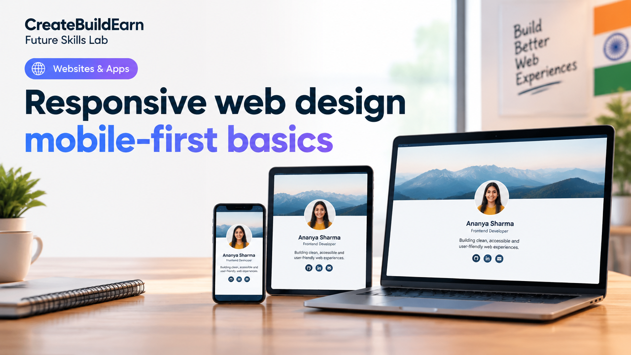
Quick Start
What you will learn/build: The core idea behind mobile-first responsive web design and a working responsive profile card page you can open on phones and desktops.
Skill level: Beginner — basic HTML & CSS. No frameworks required.
Time needed: 45–90 minutes for the main practice; extra time for refinements and testing.
What you need: A code editor (VS Code/Notepad++), modern browser (Chrome/Firefox), and optionally a smartphone for testing.
What is mobile-first responsive web design?
Mobile-first responsive design is a way of building websites that begins by designing the page for small screens (phones) and then adds styles for larger screens (tablets, desktops). The approach uses flexible layouts, relative units and media queries so content adapts to the device.
In short: start with a simple, usable phone layout, then scale up. This keeps sites fast, accessible and easier to maintain.
Why mobile-first matters (short practical reasons)
- Most users browse on phones — starting small meets majority needs first.
- Mobile-first encourages performance: smaller assets and simpler layouts by default.
- Designing up reduces the chance of hiding content on small screens.
- Search engines reward mobile-friendly sites; it helps discoverability (learn more in our SEO basics).
Prerequisites
- Basic HTML tags: <html>, <head>, <body>, headings, paragraphs, images and links.
- Basic CSS: selectors, box model, display properties and margins/padding.
- Optional: basic command of file system and opening a local HTML file in your browser.
Step-by-step: Build a simple mobile-first responsive page
Follow these concise steps. Code examples are learning examples you can paste into files locally.
- Create a folder and two files: index.html and styles.css.
- Write an HTML skeleton with the responsive viewport meta tag.
<!-- index.html (learning example) -->
<!doctype html>
<html lang="en">
<head>
  <meta charset="utf-8">
  <meta name="viewport" content="width=device-width, initial-scale=1">
  <title>Profile Card — Mobile First Example</title>
  <link rel="stylesheet" href="styles.css">
</head>
<body>
  <main class="card">
    <img src="avatar.jpg" alt="Profile avatar" class="avatar">
    <h1>Your Name</h1>
    <p class="bio">Short bio that explains who you are.</p>
    <a href="#" class="btn">Contact</a>
  </main>
</body>
</html>
Now add mobile-first CSS. Default styles are for the smallest screens. Then add a media query for wider screens.
/* styles.css (learning example) */
:root{
  --card-bg: #fff; /* simple variables help later */
  --gap: 12px;
}
*{box-sizing: border-box}
body{font-family: Arial, sans-serif;margin:20px;background:#f4f4f4}
.card{max-width:420px;background:var(--card-bg);padding:18px;border-radius:10px;margin:0 auto;text-align:center}
.avatar{width:96px;height:96px;border-radius:50%;object-fit:cover}
h1{font-size:1.2rem;margin:10px 0}
.bio{font-size:0.95rem;color:#444}
.btn{display:inline-block;margin-top:12px;padding:10px 18px;background:#0077cc;color:#fff;border-radius:6px;text-decoration:none}

/* Larger screens (tablet and up) */
@media (min-width:768px){
  .card{display:flex;align-items:center;gap:var(--gap);max-width:720px;text-align:left}
  .avatar{width:120px;height:120px}
  h1{font-size:1.4rem}
}
This code is intentionally simple. The viewport meta tag ensures correct scaling. The CSS uses small-screen defaults and a media query to change layout at 768px.
Worked example: Why this layout adapts
On phones (default): the card is a single column, center-aligned and easy to read. On wider screens (>=768px) the .card switches to flex layout to place the avatar left and text right. Because we used max-width and relative units, the same HTML fits both contexts without duplication.
Try It Now / Mini Project
Mini Project: Build a responsive profile card and test it on different screen widths.
- Create index.html and styles.css from the examples above. Use any image named avatar.jpg (or replace with a valid URL).
- Open index.html in your browser. Resize the window narrower and wider to see changes.
- Improve it: add another button, change colors, or add social links below the bio. Keep mobile-first — new features should work on phone sizes first.
Testing checklist
| Test | What to look for |
|---|---|
| Phone width (320–480px) | Content readable, buttons tappable, no horizontal scroll |
| Small tablets (600–768px) | Spacing still good, images not too large |
| Desktop (>=1024px) | Layout uses space, text left-aligned, balanced margins |
| Slow network | Page loads quickly; consider optimizing images |
Tip: Use your browser’s developer tools (Responsive Design Mode) or open the page on a phone to check touch targets and readability.
Checkpoint — Self-review
Ask yourself these questions after the mini-project:
- Does the page avoid horizontal scrolling on small widths?
- Are touch targets (buttons/links) at least 40–48px in height so fingers can tap easily?
- Does the layout expand gracefully at larger sizes without breaking?
- Are images sized with max-width or fixed pixel sizes that still look sharp?
Common mistakes (and how to fix them)
- Using fixed-width containers (e.g., width: 800px) — replace with max-width and relative units.
- Forgetting the viewport meta tag — mobile browsers will zoom out and the layout will not match your styles.
- Large images loaded on mobile — use appropriately sized images or srcset for responsive images.
- Small touch targets — make buttons larger and use spacing to avoid accidental taps.
Review checklist (printable)
| Item | Done |
|---|---|
| Viewport meta tag present | [ ] |
| Mobile-first CSS (defaults target small screens) | [ ] |
| Media queries add styles for larger breakpoints | [ ] |
| Images optimized or use srcset | [ ] |
| Buttons sized for touch | [ ] |
| Tested on actual phone or browser responsive mode | [ ] |
Next practice & learning path
After this mini-project, try these next steps to build real skills:
- Use CSS Grid to create multi-column layouts for larger screens.
- Add responsive images with srcset and sizes attributes.
- Convert this static page into a small portfolio item and publish it.
Relevant learning links from our site:
- How to Make a Website: A Beginner Roadmap
- How to Start Coding: A Beginner’s Inspiring Roadmap
- Beginner Portfolio Before Client Work: Build a Strong Self-Initiated Project Portfolio
- 4 Week Digital Creator Beginner Learning Path: Learn, Create, Grow
Frequently Asked Questions
What does “mobile-first” actually mean?
Mobile-first means you write your default HTML/CSS for small screens, ensuring the experience is good on phones. Then you add rules for larger screens using media queries. It is about the development order and default assumptions, not a special technology.
What viewport meta tag should I use?
Use <meta name=”viewport” content=”width=device-width, initial-scale=1″>. This tells the browser to use the device width for layout and prevents automatic scaling that breaks mobile layouts.
How do I choose breakpoints?
Choose breakpoints based on your design and content, not device brands. Common ones are 480px, 768px and 1024px, but pick where your layout needs to change to remain readable and usable.
Should I use a framework like Bootstrap?
Frameworks can speed development and offer tested components, but learning mobile-first basics without a framework is valuable. Use frameworks when you understand what they’re doing and can customize them safely.
How can I optimize images for mobile?
Use appropriately sized images, compress them, and use srcset/sizes to serve smaller files to small screens. Consider modern formats like WebP if the browser support fits your audience (verify current support before shipping).
How do I test on real devices cheaply?
Use your own phone or ask friends/family to test. Browser dev tools have device emulation modes which are useful but do not replace real-device testing for touch and performance checks.
Is accessibility different for mobile-first?
Accessibility principles are the same: readable contrast, semantic HTML, keyboard navigation where applicable, and clear touch targets. Mobile-first simply adds an emphasis on touch and small-screen readability.
Conclusion
Mobile-first responsive web design helps you build pages that work well on phones and scale up to larger screens. Start small, test often, and keep layouts flexible using relative units and media queries. Practice by building simple components (like the profile card) and then expand to multi-section pages.
Next skill to learn: responsive images with srcset and CSS Grid for multi-column layouts. When you are ready, check our beginner guides on coding and publishing for a full learning path.
Learn it by building something
Use the guide as a learning checklist, build a small version yourself, test it, explain what you learned and then improve the project.
How this guide was prepared
This guide is prepared for everyday readers using practical research, usability checks and editorial review. Product or tool-specific claims should be verified against current official documentation when needed.
How did you like this article?
Your feedback helps us make our guides more useful.

Join the Discussion
Join the conversation and share a useful tip, question or experience.