
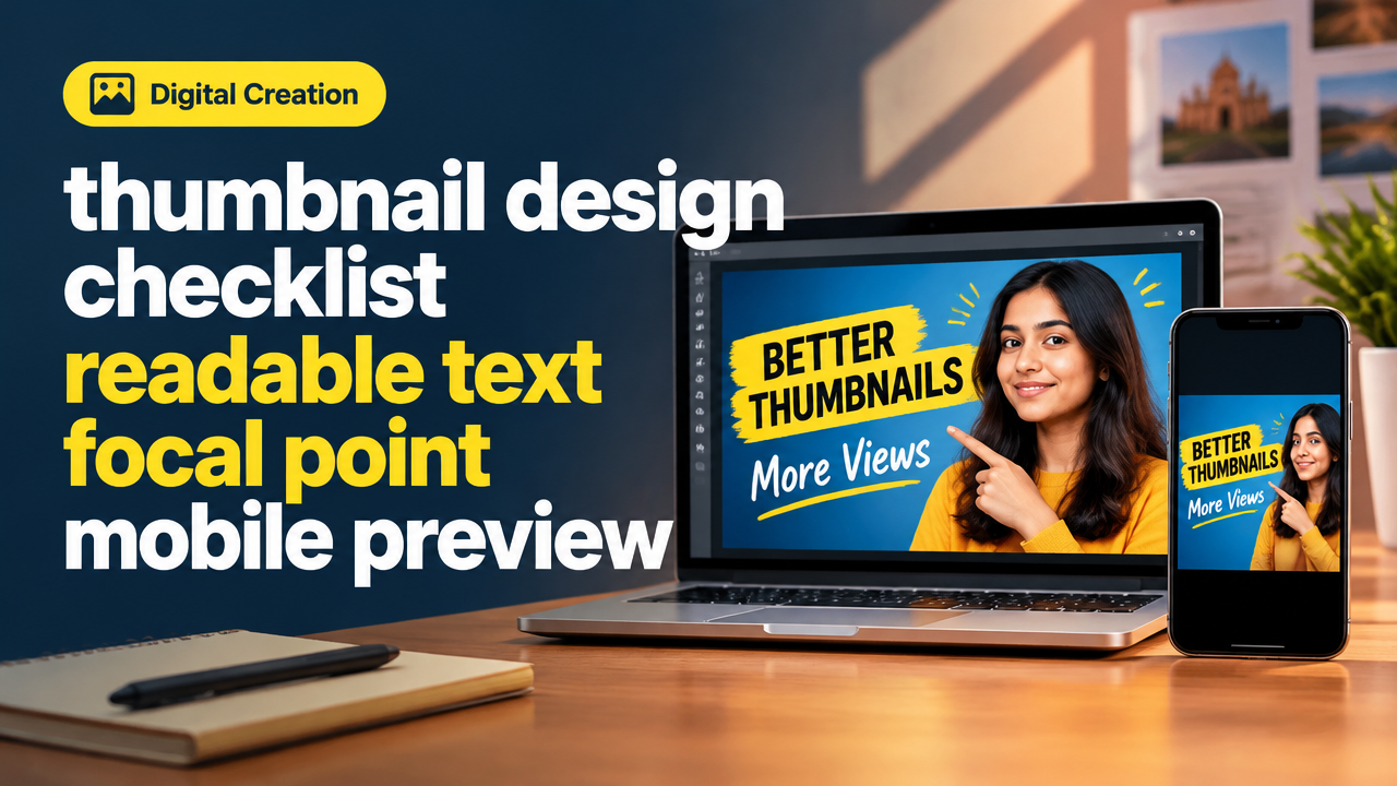
Quick Start
What you will learn/build: A compact checklist and step-by-step workflow to design thumbnails that read well at small sizes, with a strong focal point and a tested mobile preview.
Skill level: Beginner — no prior design tools experience required.
Time needed: 20–60 minutes for a first thumbnail; 5–15 minutes for revisions and mobile testing.
What you need: Any image editor (Canva, Figma, Photoshop, or free alternatives), a smartphone for mobile preview, and the image or screenshot you want to use.
Why readable thumbnails, focal point and mobile preview matter
Most viewers see thumbnails on small phone screens. If text is tiny, the focal subject is unclear, or the layout reads poorly on mobile, people skip your content. Good thumbnails guide the eye quickly: strong focal point, short bold text, clear contrast and tested mobile legibility.
Core thumbnail design checklist (quick view)
| Item | Why it matters | Quick rule |
|---|---|---|
| Canvas size | Source size determines quality | Use platform recommended size (e.g., 1280×720 for YouTube) |
| Focal point | What you want viewers to notice first | Place subject on rule-of-thirds; use shallow depth or background blur |
| Readable text | Short headline must read at mobile size | 3–4 words, 36–64px equivalent, high contrast |
| Contrast & color | Separates text from background | Use dark text on light areas or add solid/gradient overlay |
| Spacing | Prevents clutter | Keep edges clear (safe margin ~5–10% of width) |
| Mobile preview test | Real check before export | Zoom to 10% in editor and view on phone |
| File export | Balancing quality and size | Export high quality JPEG/PNG, compress losslessly for web |
Step-by-step path: design for readable text and a clear focal point
Follow these practical steps from blank canvas to mobile-tested export.
- Choose canvas size. Start with the platform’s recommended size (e.g., 1280×720 px for many video platforms). This keeps aspect ratio correct.
- Pick a single clear subject. Crop tightly so the subject occupies a large portion of the frame. If it’s a face, show expression and eye contact.
- Set the focal point. Place the subject on one of the rule-of-thirds intersections. Leave negative space where you will add text.
- Add a short, bold headline. Use 2–4 words. Make font heavy (sans-serif or slab serif). Keep line length short — ideally one line on mobile.
- Create contrast for text. If the background is busy, add a semi-opaque rectangle, gradient, or stroke behind text. Contrast ratio matters: make text noticeably lighter or darker than its background.
- Use size and weight, not many words. Increase font weight and spacing instead of adding words to explain.
- Test at small sizes. Zoom canvas down to ~10–15% or export a 350–500 px wide copy and view on your phone to check legibility.
- Refine and export. Remove distractions, keep safe margins, and export as a high-quality JPEG or PNG. Compress as needed without losing legibility.
Worked example: Study tips video thumbnail
Walkthrough showing how the checklist applies. Suppose you’re making a thumbnail for “Top 5 Study Tips” video.
- Canvas: 1280×720 px.
- Subject: Close-up photo of a student holding a notebook. Crop so face and notebook are large.
- Focal point: Face on right-third, notebook on left-third to leave negative space above the notebook for text.
- Text: “5 Study Tips” — 2 words plus number; large, bold sans-serif. White text with 3 px dark stroke for extra separation.
- Contrast: Slight dark gradient behind left side where text sits to make the white text pop.
- Mobile test: Export a 480 px wide version and open on phone. The text should be readable at a quick glance; if not, increase text size or shorten to “Top 5 Tips”.
This simple example shows how few elements—strong subject, short text, and contrast—make a thumbnail work on mobile.
Image export, compression and file-size tips
Export settings affect perceived sharpness on phones and slow networks. Export at the original canvas size first, then compress a copy.
- Export as JPEG (good balance) or PNG (for sharp edges/transparency).
- Quality 80–90% for JPEG is often fine. Avoid ultra-low quality which blurs small text.
- Use lightweight compressors or built-in tools to reduce size while keeping readability. Learn more about how image compression affects file size and quality in this guide: How Image Compression Changes File Size and Quality.
Testing mobile preview: quick checks you can run
Do these tests before you finalize the thumbnail.
- Zoom down in your editor to 10–15%—does text remain legible?
- Export a small preview at 480 px wide and send it to your phone or open the image link on your phone browser.
- View in the actual app context (feed, video list, or story) if possible to check cropping and overlays like play buttons or timestamps.
- Check both bright and dark phone modes (some apps add dark overlays) and ensure contrast still works.
If you want a deeper look at mobile-first layout thinking, see Responsive Web Design Mobile-First Basics for general guidance that transfers to image design.
Try It Now / Mini Project
Design a thumbnail for a short learning video (example: “3 Quick Math Tricks”). Use the checklist above and aim to finish in 30–45 minutes.
Steps:
- Create a new 1280×720 canvas.
- Place a clear subject (photo or illustration) occupying ~40–60% of frame.
- Add a 2–3 word headline. Ensure it fits in one line on mobile preview.
- Add a subtle overlay behind text and test export at 480 px wide on your phone.
- Make one revision to improve legibility (increase size, change color, or shorten text) and re-test.
When you finish, write one sentence: what change made the biggest improvement and why.
Checkpoint: quick self-review before publishing
Answer these 5 yes/no questions:
- Is the headline 2–4 words and legible on a phone?
- Is the subject clearly visible and the focal point obvious?
- Is there a margin around text and subject (no edge cropping)?
- Does contrast hold up in a mobile preview?
- Is file size reasonable for web without losing clarity?
If you answered “no” to any item, revise that specific area and test again.
Common mistakes and how to avoid them
- Too many words. Avoid long headlines—shorten or use a subtitle sparingly.
- Small, decorative fonts. Use strong, readable fonts; decorative scripts fail on mobile.
- Busy backgrounds. Add overlays or blur background to separate text.
- No mobile preview. Always check on a real phone before finalizing.
- Ignoring platform overlays. Remember play icons or timestamps can cover central elements—place important content away from center when possible.
Review checklist before export
| Check | OK? |
|---|---|
| Canvas matches platform ratio | ☐ |
| Headline short and readable on phone | ☐ |
| Focal point obvious and uncluttered | ☐ |
| Contrast good (test dark/light modes) | ☐ |
| Safe margins kept | ☐ |
| Exported and tested on phone | ☐ |
Next practice and learning roadmap
After mastering this checklist, practice these next skills:
- Create 5 thumbnails for different video topics to learn consistency and speed.
- Study simple typography and color contrast further (try alternating weights and background overlays).
- Learn basic thumbnail workflows inside your editor—see video editing export steps here: Video Editing Workflow.
- If you use AI image tools to create backgrounds, follow verification and privacy checks from the site’s AI guidance and use original or licensed images responsibly.
- Build a small gallery of your best thumbnails in a portfolio—this helps when you turn design into a service.
Frequently Asked Questions
How large should text be for mobile thumbnails?
There is no single pixel size across tools, but aim for a font size and weight that remains readable when the image is shown at 20–30% of its original size. In practice, choose a large, bold font and prefer fewer words rather than tiny sizes. Always test on a phone.
Which fonts work best for thumbnails?
Sans-serif or strong slab serif fonts with bold weights are most legible at small sizes. Avoid fine scripts or thin display fonts. Use consistent fonts across your content for brand recognition.
Should I always add a face to thumbnails?
Faces can improve click recognition because humans respond to expressions. However, non-face thumbnails work well when the subject or object is clear and the text is short and bold. Use what fits your content style.
How do I check thumbnails for platform overlays like play buttons?
Preview your thumbnail in the app or platform’s upload interface when possible. If not, simulate overlays by placing a translucent circle or play icon over the center to ensure important elements are not hidden.
Can I use AI to generate thumbnail images?
Yes, but use AI responsibly. Verify that AI-generated images do not violate copyrights, avoid uploading personal data into public tools, and double-check image content for accuracy and ethical considerations.
How much should I compress a thumbnail?
Balance quality and size. Aim for the smallest file that retains crisp text and subject detail. Start with quality 80–90% for JPEG and test on mobile. Use lossless or web-optimized compressors if available.
What is a good workflow to speed up thumbnail creation?
Create a reusable template with text placeholders, color overlays and safe margins. This lets you swap photos and text quickly while keeping consistency across your channel or page.
Conclusion and next skill to learn
Readable text, a clear focal point and a reliable mobile preview make the difference between a skipped image and a click. Use the checklist and mini project to practice quick iterations. Next, learn consistent visual branding and batch thumbnail templates to scale your output—good next skill: personal brand consistency and proof of work: Personal Brand Consistency and Proof of Work.
Relevant learning links: Image compression guide, Video editing export workflow, Responsive mobile-first basics, Personal brand consistency.
Learn it by building something
Use the guide as a learning checklist, build a small version yourself, test it, explain what you learned and then improve the project.
How this guide was prepared
This guide is prepared for everyday readers using practical research, usability checks and editorial review. Product or tool-specific claims should be verified against current official documentation when needed.
How did you like this article?
Your feedback helps us make our guides more useful.

Join the Discussion
Join the conversation and share a useful tip, question or experience.