
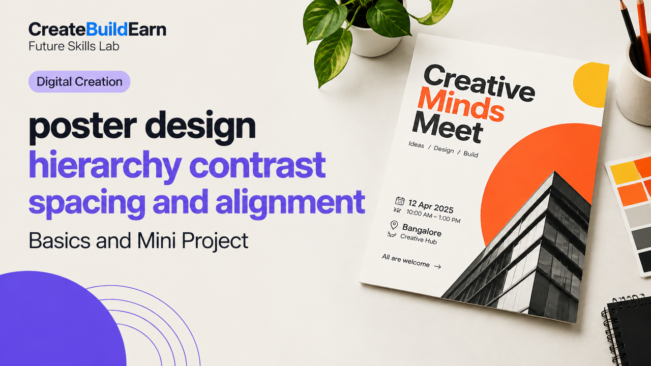
Quick Start
What you will learn/build: Basic poster design skills focused on visual hierarchy, contrast, spacing and alignment. You will design a simple event poster (digital or print-ready) using free or familiar tools.
Skill level: Beginner — no prior design experience required.
Time needed: 60–120 minutes for the lesson and mini project.
What you need: A computer or tablet, a free design tool (Canva, Figma, Krita, or a simple image editor), two images (one focal photo + one logo), and the event text (title, date/time, location, call-to-action).
Introduction: Why hierarchy, contrast, spacing and alignment matter
Good poster design helps the viewer understand the message quickly. Visual hierarchy shows which elements are most important. Contrast makes those elements readable and attention-getting. Spacing (or white space) organizes content and gives breathing room. Alignment creates visual order and a professional look. These four basics work together: improve one and the whole poster becomes clearer and more effective.
Prerequisites and simple checklist
Before you start, gather these basics:
- Short headline (6–10 words)
- One supporting sentence or tagline
- Date, time, and place (or website link)
- One primary image and a small logo or icon
- Design tool (Canva, Figma, or free image editor)
| Item | Ready? |
|---|---|
| Headline | Yes / No |
| Supporting copy | Yes / No |
| Image(s) | Yes / No |
| Logo / Contact | Yes / No |
| Tool open | Yes / No |
Core concept: Visual hierarchy explained simply
Visual hierarchy is the order your eyes follow on a page. Designers control hierarchy with size, weight, color, and placement. A strong headline is the largest item. Secondary information is smaller or lighter. Tertiary details (like address) are the smallest or placed at the bottom. Always ask: what must the viewer read first? Make that element obvious.
Contrast: Make the message readable and visible
Contrast is about differences: dark vs light, big vs small, bold vs thin. High contrast draws attention and improves readability. Use contrast for:
- Text over images: add a semi-transparent overlay or place text on a solid block for legibility.
- Headline vs body: larger size and bold weight for the headline.
- Color contrast: avoid low-contrast color pairs (light gray on white).
Spacing and alignment: Order and breathing room
Spacing (margins and padding) separates blocks so each idea is clear. Alignment (left, center or right) creates structure. Common rules:
- Group related items close together; separate different groups with more space.
- Use consistent margins around the edge (don’t hug the edge with text).
- Align text and images to a simple grid—left-aligned text reads faster in many languages.
Step-by-step path: From blank page to a clear poster
- Set your canvas: choose orientation and size. For social posts use 1080×1350 or 1200×628; for print choose a standard size (A3, A4) and check bleed in your tool.
- Add margins: leave at least 10% of the short side as safe margin.
- Place the image: choose one focal image and place it so it supports the headline (left or top works well).
- Add the headline: make it the largest element and position it where viewers look first (upper third is typical).
- Add supporting text: smaller than the headline and grouped near it.
- Add date/time and CTA: place them where the eye naturally goes after the headline—often lower or right-side block.
- Check contrast and spacing: ensure text over images is readable; increase space if content feels cramped.
- Align to a grid: use 2–3 columns or a basic rule-of-thirds grid for alignment consistency.
Worked example: Designing a concert poster in 8 minutes
Scenario: You need a small poster for a college music night. Canvas: A4 portrait.
- Step 1: Set a 10 mm margin around the A4 canvas.
- Step 2: Place the band’s photo to fill the left two-thirds, cropped tightly on the performers.
- Step 3: Headline: “Campus Jam Night” — set at 48 pt, bold, top-right over a semi-transparent dark block so it reads over the image.
- Step 4: Supporting line: “Live bands • 7pm • Student Union” — 18 pt, placed under the headline, left-aligned to the headline edge.
- Step 5: CTA: “Free Entry | RSVP” — 24 pt, contrast color (bright accent), inside a small rounded rectangle bottom-right.
- Result check: Headline is largest, high contrast over image, details grouped and spaced, all elements aligned to an invisible right column.
Try It Now / Mini Project
Create a poster for a simple event: “Portfolio Review Night”. Spend 60–90 minutes. Use any free tool. Follow this workflow:
- Create a canvas (1080×1350 px).
- Pick one hero image and place it left or top-third.
- Write a clear headline (max 8 words). Place it where the eye lands first.
- Set contrast: make the headline easy to read over the image (overlay, stroke or solid block).
- Group date/time/venue together with smaller type and align them.
- Export a PNG. Share with a friend and ask: “What did you read first?” Use feedback to tweak spacing and contrast.
Checkpoint: Self-review questions
Use these to test your poster before finalizing:
- Can someone tell the headline message in 2–3 seconds?
- Is the headline clearly larger and more prominent than other text?
- Are the most important details grouped and easy to find?
- Is all text readable against backgrounds at normal viewing size?
- Do elements line up visually (no one element feels out of place)?
Common mistakes and how to fix them
- Too many fonts: limit to 2 complementary fonts. Fix: replace extras with bold/regular styles.
- Low contrast text on images: add an overlay, move the text, or use a solid color panel.
- Crowded layout: increase spacing and use consistent margins.
- Random alignment: switch to a grid or column system and snap items to it.
- Unclear hierarchy: make the headline bigger, bolder or change its color to stand out.
Review checklist before export
| Check | Yes |
|---|---|
| Headline readable in 2–3 seconds | ☐ |
| Primary image supports message | ☐ |
| Margin and spacing consistent | ☐ |
| Text contrast is sufficient | ☐ |
| Export settings correct (size, DPI for print) | ☐ |
Next practice: Iteration and variations
Make two alternate versions of your poster: one with a different color accent and one with the image on the opposite side. Compare which one communicates faster. This trains your eye for hierarchy and contrast decisions.
Tools, safe AI tips and verification
Recommended beginner tools: Canva (template-driven), Figma (flexible, free tier), Krita or Photopea (image editors). If you use AI tools for image ideas or text suggestions, verify accuracy and copyright. Do not paste private data. Check any AI-generated image for licensing before public use. When using AI to generate copy or images, edit for clarity and confirm facts such as dates and names.
Useful internal learning links
- Poster Project Brief Design Review Checklist — Create and Final Poster Ready for Print or Web
- Aspect Ratio, Resolution, File Format & Tools for Creators Explained
- How to Choose a Design Video or Writing Tool Based on Task
- Graphic Design Basics: A Beginner Guide
Frequently Asked Questions
How large should a headline be for a poster?
There is no single number because it depends on canvas size and viewing distance. For social posters (1080px wide), try headline sizes between 36–72 pt depending on font. For print, aim for visually larger text—test by viewing at actual size. The most important rule: headline must be clearly larger than supporting text.
What color contrast should I use for readability?
High contrast is best: dark text on light background or light text on dark background. Aim for a clear difference in brightness and color. Tools like color contrast checkers can help; if you’re unsure, test by squinting at the design—if the text still reads, contrast is likely sufficient.
Should I always center-align poster text?
No. Center alignment can work for simple, formal layouts, but left alignment is often easier to read and more flexible for hierarchical layouts. Choose the alignment that supports your composition and be consistent.
How much white space is enough?
There’s no fixed amount. Use margins at the edges (10% of short side is a good start) and increase space between unrelated groups. If something feels cramped, add space. White space guides attention and improves clarity.
Can I use AI-generated images in posters?
Yes, but check the AI tool’s license and the platform rules where you’ll publish. Verify that the image is appropriate and not infringing on trademarks or portraits without consent. When in doubt, use your own photos or stock images with clear licenses.
What export settings should I use for print?
For print, export at 300 DPI with the correct physical dimensions (A4, A3) and include bleed (typically 3–5 mm) if you expect the design to print to the edge. Save as PDF or high-quality TIFF/PNG depending on printer requirements.
How do I practice improving hierarchy?
Create multiple thumbnails of the same poster with different sizes and placements for the headline and image. Compare which version communicates faster. Ask peers which one they read first and adjust accordingly.
Conclusion and the next skill to learn
Mastering hierarchy, contrast, spacing and alignment will make your posters clearer and more professional. Your next skill to learn: color theory and typography pairing—this helps you choose typefaces and color palettes that strengthen hierarchy and mood. For a guided path, try the 4 Week Digital Creator Beginner Learning Path.
Ready to build a portfolio? When you have 3–5 refined poster projects, collect them into a simple portfolio. See Beginner Portfolio Before Client Work to learn how to present projects professionally.
Good design grows with practice: iterate, get feedback, and keep improving your eye for hierarchy and clarity.
Learn it by building something
Use the guide as a learning checklist, build a small version yourself, test it, explain what you learned and then improve the project.
How this guide was prepared
This guide is prepared for everyday readers using practical research, usability checks and editorial review. Product or tool-specific claims should be verified against current official documentation when needed.
How did you like this article?
Your feedback helps us make our guides more useful.

Join the Discussion
Join the conversation and share a useful tip, question or experience.