
Quick Start
What you will learn/build: How to choose aspect ratio, resolution and file format for images and video; export ready assets for YouTube, Instagram and web.
Skill level: Beginner (no coding required).
Time needed: 45–90 minutes for reading and the mini-project.
What you need: A computer, any image editor (Canva, Figma, Photoshop, GIMP or online editors), one source image (high resolution), and a browser.
Why aspect ratio, resolution and file formats matter
Creators often think “bigger is better,” but delivery, speed and platform rules matter. Aspect ratio controls shape, resolution controls detail and file format controls quality vs file size. Choosing the right combo saves time, keeps images sharp, and prevents awkward crops or slow-loading pages.
Key concepts — simple explanations
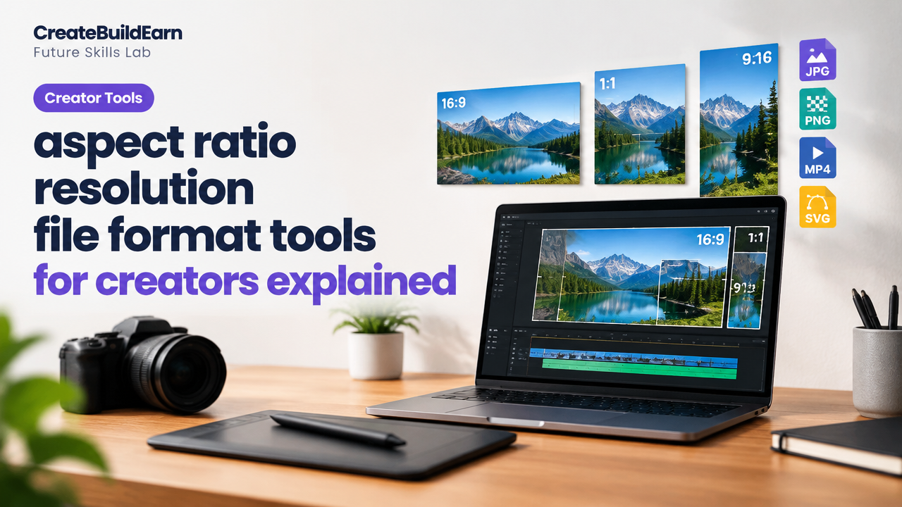
- Aspect ratio: The width:height relationship (e.g., 16:9, 1:1). It determines the shape and composition.
- Resolution: Pixel dimensions like 1920×1080 (width × height). Higher resolution = more detail, but larger file size.
- Pixel density / PPI: Useful for print. For screens, pixel dimensions matter more than PPI.
- File formats: JPEG for photos, PNG for transparency, WebP for small files with quality, SVG for vector shapes, MP4 for video.
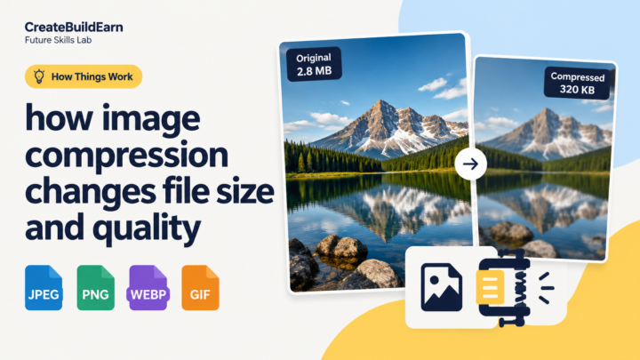
- Compression: Lossy (smaller files, some quality loss) vs lossless (larger files, no quality loss).
- Color profile: sRGB is the standard for web; use it to avoid color shifts in browsers.
Choose aspect ratio and resolution for common platforms (quick guide)
Use this as a starting point. Platforms update sizes—always verify on the platform if exact numbers matter.
| Use | Aspect ratio | Typical resolution | Format |
|---|---|---|---|
| YouTube video | 16:9 | 1920×1080 (Full HD) or 1280×720 (min) | MP4 (H.264) |
| YouTube thumbnail | 16:9 | 1280×720 (min) | JPG/PNG |
| Instagram post | 1:1 (square) or 4:5 (vertical) | 1080×1080 or 1080×1350 | JPG/PNG/WebP |
| Instagram Story / Reels / Shorts | 9:16 (vertical) | 1080×1920 | MP4 (video) or JPG/PNG (image) |
| Website hero image | Varies — often 16:9 or custom | 1200–1920px wide | WebP/JPG/PNG |
| Logo / icons | Vector (any) | SVG preferred | SVG/PNG for export |
File formats: when to use each
- JPEG / JPG: Best for photos. Good compression, not for transparency. Use when file-size matters.
- PNG: Use for images that need transparency or sharp edges (icons, logos). Larger files than JPG.
- WebP: Modern format that often gives smaller files with similar quality. Good for web; check browser support for your audience.
- SVG: Scalable vectors for logos and icons. Small and crisp at any size; not for photos.
- MP4 (H.264/HEVC): Standard for video across platforms. Balance bitrate and resolution for quality and size.
- GIF: Short animated loops. Use sparingly; consider MP4 for longer clips to save size.
Tools and workflow for creators
Pick tools that fit your skills. Basic workflow: create at high resolution, crop to the correct aspect ratio, export to target resolution and format, test on device.
- Design/edit: Canva, Figma, Photoshop, GIMP (free).
- Resize & compress: Squoosh.app, ImageOptim, TinyPNG, WebP converters.
- Video export: HandBrake, Adobe Premiere Rush, DaVinci Resolve.
- Check results on phone and browser before publishing.
Worked example: Export one image for YouTube thumbnail and Instagram post
Goal: Start from a 4000×3000 JPG (landscape photo) and make these outputs:
- YouTube thumbnail: 16:9, 1280×720 JPG, under 2 MB.
- Instagram post: square 1080×1080 JPG, under 1 MB.
Steps:
- Open the source image in your editor.
- Crop to 16:9 for the YouTube thumbnail. On 4000×3000 original, a 16:9 crop might be 4000×2250—crop vertically to keep the main subject.
- Resize the cropped image to 1280×720. Use bicubic or “preserve details” resampling for best sharpness.
- Export as JPG at 80% quality or use WebP to reach the target file size. Convert and check file size; if >2 MB, reduce quality to 70–75%.
- For Instagram, crop the original to 1:1 (e.g., 3000×3000 if possible). Resize to 1080×1080 and export as JPG at 75–85% or WebP for better compression.
Tip: Keep a layered or high-resolution master file so you can re-export later for different sizes without quality loss.
Try It Now / Mini Project
Project: Make three deliverables from one master image — a YouTube thumbnail (16:9), an Instagram post (1:1) and an Instagram story (9:16).
Steps:
- Choose a high-res photo or a screenshot (min 2000 px on the longest side).
- Create three artboards/copies in your editor: 1280×720, 1080×1080, 1080×1920.
- Compose each frame: keep the subject centered or follow the rule of thirds. For text, leave safe margins (about 10% from edges).
- Export: JPG or WebP for images. Aim for image files under 2 MB for thumbnails and under 1 MB for social posts.
- Upload to your phone or use the platform preview to check cropping and legibility.
Deliverable: Three exported files named thumbs_youtube.jpg, post_instagram.jpg, story_instagram.jpg and a one-line note about what you changed for each.
Checkpoint / Self-review
Use these self-test questions to confirm learning:
- Did you keep the main subject inside the safe zone (no important details cut off)?
- Are the exported files under the target file sizes while still looking sharp on a phone?
- Did you use sRGB for color when exporting for web/social?
- Is each output in the correct aspect ratio and resolution?
Common mistakes creators make
- Exporting one file and using the same crop for all platforms—leading to awkward composition.
- Using PNG for photos (big files) when JPG or WebP is better.
- Not checking the image on an actual mobile device—legibility may differ from desktop view.
- Forgetting safe margins for text and logos; platforms often overlay UI elements.
- Not keeping a master file, so later edits require starting over at low quality.
Review checklist before publish
| Check | Yes / No |
|---|---|
| Correct aspect ratio for the platform | |
| Correct resolution and file size | |
| Color profile set to sRGB | |
| Text legible on phone screens | |
| Master file saved (PSD/FIG/PNG) |
Next practice / roadmap
After this guide, try these next skills to become a more consistent creator:
- Learn composition and thumbnail design basics — see “What Makes a Good Poster or Thumbnail?” (internal link).
- Study graphic basics for consistent brand assets — see “Graphic Design Basics” (internal link).
- Plan how these assets fit your social strategy — read “Social Media Content Strategy Goals and Formats” (internal link).
- Build a simple website to host and show your work — “How to Make a Website: A Beginner Roadmap” (internal link).
Frequently Asked Questions
What is the difference between aspect ratio and resolution?
Aspect ratio is the proportional shape (width:height). Resolution is the actual pixel dimensions (e.g., 1920×1080). Aspect ratio keeps shape; resolution controls detail.
Should I always export the largest resolution possible?
No. Export appropriate resolutions for the platform. Very large files slow loading and may be downsampled by platforms. Keep a high-res master for future exports.
When should I use WebP instead of JPG?
Use WebP for web images where smaller file size matters and browser support is acceptable for your audience. Use JPG if you need maximum compatibility without server-side conversion.
How do I keep text legible on small phone screens?
Use larger font sizes, high-contrast colors, and leave safe margins. Preview on an actual phone before publishing.
What color profile should I use for web images?
Use sRGB for web and social — it’s the safest option for consistent color across browsers and devices.
Is SVG always better than PNG for logos?
SVG is best if your logo is vector-based — it scales cleanly and is usually smaller. Use PNG when you need a raster export (for platforms that don’t support SVG).
Can I use AI to create or resize images?
Yes, but verify the output for accuracy, check copyright and model-release rules, and avoid sharing personal or private data. Use AI responsibly and test results before publishing.
Conclusion — next skill to learn
Understanding aspect ratio, resolution and file formats is a practical foundation for every creator. Your next skill: learn composition and thumbnail design to improve click-through and engagement. Try the linked resources above and repeat the mini-project with new source images to build confidence.
Learn it by building something
Use the guide as a learning checklist, build a small version yourself, test it, explain what you learned and then improve the project.
How this guide was prepared
This guide is prepared for everyday readers using practical research, usability checks and editorial review. Product or tool-specific claims should be verified against current official documentation when needed.
How did you like this article?
Your feedback helps us make our guides more useful.

Join the Discussion
Join the conversation and share a useful tip, question or experience.